React Native DateTime Picker
In almost every application we need the date or time picker. When we want our user to pick the date and time like their birthdate and time then this is useful.
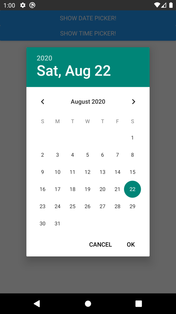
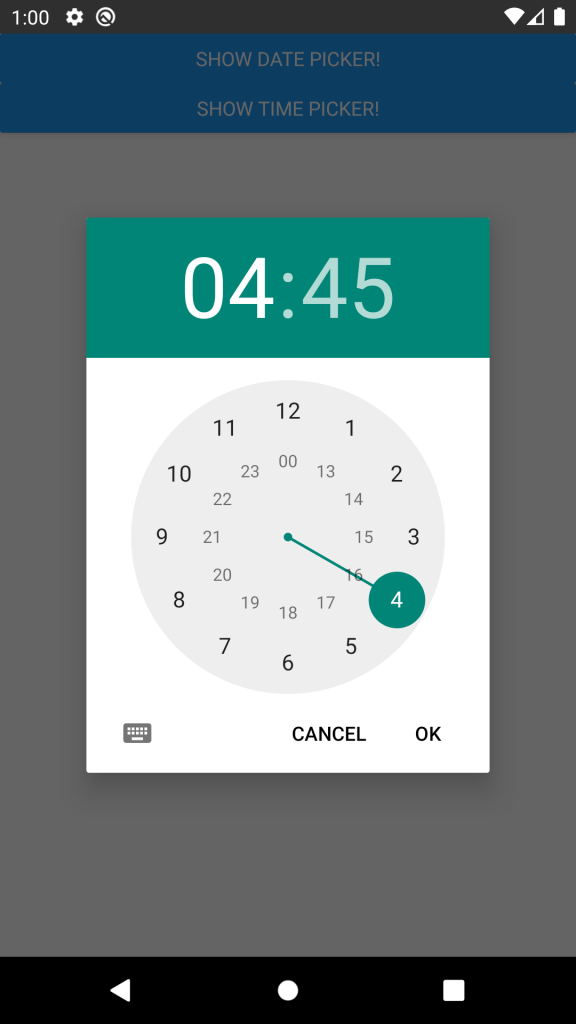
Preview of React Native DateTime Picker
Installation
using npm
npm install @react-native-community/datetimepicker --save
using yarn
yarn add @react-native-community/datetimepicker
Usage of React Native DateTime Picker
Firstly import the library
import DateTimePicker from '@react-native-community/datetimepicker';
usage with state
import React, {useState} from 'react';
import {View, Button, Platform} from 'react-native';
import DateTimePicker from '@react-native-community/datetimepicker';

export const App = () => {
  const [date, setDate] = useState(new Date(1598051730000));
  const [mode, setMode] = useState('date');
  const [show, setShow] = useState(false);

  const onChange = (event, selectedDate) => {
    const currentDate = selectedDate || date;
    setShow(Platform.OS === 'ios');
    setDate(currentDate);
  };

  const showMode = (currentMode) => {
    setShow(true);
    setMode(currentMode);
  };

  const showDatepicker = () => {
    showMode('date');
  };

  const showTimepicker = () => {
    showMode('time');
  };

  return (
    <View>
      <View>
        <Button onPress={showDatepicker} title="Show date picker!" />
      </View>
      <View>
        <Button onPress={showTimepicker} title="Show time picker!" />
      </View>
      {show && (
        <DateTimePicker
          testID="dateTimePicker"
          value={date}
          mode={mode}
          is24Hour={true}
          display="default"
          onChange={onChange}
        />
      )}
    </View>
  );
};
Important useful Properties (props)
Now comes the most important part. For implementing this we need to use all important props according to our need. So some important once are here.
Mode
Defines the type of the picker.
- date
- time
display
Defines the visual display of the picker. The default value is "default".
List of possible values for Android
"default"– Show a default date picker (spinner/calendar/clock) based onmodeand Android version."spinner""calendar"(only fordatemode)"clock"(only fortimemode)
List of possible values for iOS
"default"– Automatically pick the best style available for the current platform & mode."spinner"– the usual appearance with a wheel from which you choose values"compact"– Affects only iOS 14 and later. Will fall back to “spinner” if not supported."inline"– Affects only iOS 14 and later. Will fall back to “spinner” if not supported.
onChange
Date change handler. This is called when the user changes the date or time in the UI. It receives the event and the date as parameters.
setDate = (event, date) => {};

<DateTimePicker onChange={this.setDate} />;
value
define date and time values.
<DateTimePicker value={new Date()} />
other useful props
maximumDateminimumDate
If you have any problem regarding this comment down below.

